


Morandi Muted Dome Pendant
Morandi Muted Dome Pendant
Couldn't load pickup availability
 Quality checked
 Genuine product
 Covered by warranty
Product details
Product details
A smooth dome shade in a muted Morandi palette, the greyed-off tones associated with the painter's still lifes. Those colours are the point: they are saturated enough to register as colour but dusty enough to sit alongside neutrals without fighting them.
The dome shape contains the source and directs light downward into a defined pool, so there is no glare from a seated position underneath. That makes it usable over a dining table or a worktop rather than only decorative, which is not true of every coloured pendant.
Five tones. Black is the most graphic. Yellow and pink are the warmest and softest. Green and red are the most decorative, and both work best as the single strong colour in a restrained room. A run of two or three in the same tone reads better along an island than mixing them. Hang the bottom around 75 to 85 cm above a tabletop. Installation by a competent person. Wipe the dome with a dry cloth to keep the muted finish free of dust, which shows more readily on a matte surface than a gloss one. Yellow or pink suits a kitchen with warm timber cabinetry, while black or green sits better in a room already built around darker, more saturated colours.
- Product type: Pendant light
- Colours available: Yellow, Red, Black, Green, Pink
- Shade: Smooth dome in muted Morandi tones
- Light: Soft diffused downward glow
- Use: Dining tables, kitchens, living rooms, bedrooms
- Installation: To be fitted by a competent person; isolate the circuit before work
- In the box: 1 x pendant light, fixings


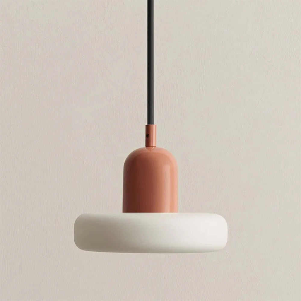

Colour That Does Not Fight The Room
The Morandi palette is greyed off on purpose, the same muted tones the painter used in his still lifes. Saturated enough to register as real colour, dusty enough to sit beside neutrals without shouting over them.

Usable, Not Only Pretty
The dome contains the source and pushes light down into a defined pool, so there is no glare from a seated position underneath. That is what lets a coloured pendant work over a dining table or a worktop instead of only looking good empty.

Pick One Tone, Not Three
Black is the most graphic. Yellow and pink are the warmest. Green and red are the most decorative and work best as the single strong colour in a restrained room. Along an island, two or three in the same tone read far better than a mix.